Gephi the Malaysian art scene
Gephi the Malaysian art scene
what I learn from a weekend of doing network analysis
Over the weekend, I finally sat myself down to learn the basics of network analysis using Gephi. While it is still a daunting system to navigate around, I felt that it was made a lot easier after spending the prior month learning how to use spreadsheets for humanities research. I cannot recommend enough Nancy Um's tutorial on this topic (not specific to network analysis though).
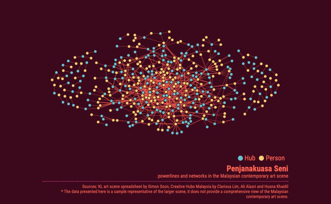
This foundational knowledge allowed me to build a big enough dataset (with more than 600 'edges' or relationships between cultural workers and the 'collectives/hubs/institution' they are networked to in Malaysia) over a 2 day period. It helps to already have the knowledge in one's head, but I also supplemented my slightly outdated knowledge with the dataset created by my students Clarissa, Husna and Ali for the creativehubs project and also a bit of cyber-trawling.
Producing a clean dataset is more challenging than I expected. When dealing with big data, it's so easy to mis-categorise, and produce repetition, or imprecise/corrupt value. Cleaning took a bit of time, but once you figured out spreadsheet, it makes the whole process of producing datasets quicker, and managing them a lot more efficient.

Once the dataset is ready, I fed it into Gephi and then had to figure out how to express this data. Initially I was working from the Brown University's guide, which was useful to understand spreadsheet format specific to network analysis. It wasn't so helpful when it came to the expression part. I quickly switched to one of Miriam Posener's guides and was able to finally express something that gave me a sense of what are some of the possibilities and limitations of network analysis.
So what have I learned? These are some preliminary observations from a 2-day old Gephi n00b. There's no point in doing network analysis if you're not asking a different set of questions about your humanities research topic.
The focus here is on scales that are very hard for our human brain to comprehend but with the help of computing, we are able clarify certain patterns and tendencies through visualising these networks. The dataset needs to be big enough. My go to example for a poorly-conceived network graph is the one made for 'Key Pre-Independence Malay Periodicals in Singapore' under the NUS Digital Scholarship.
If the information in this network is something that I could mentally figure out in my head, then the graph appears to be rather redundant. Rather than start small, my gut feeling is that beginners needs to already learn by using a big enough dataset to better grasp the possibilities and challenges inherent to this method.
That's why many tutorials tend to provide a large sample dataset. However, this has deterred me for the longest time, and it was only after I found a topic I want to figure out that I was motivated to give network analysis a go.
Which brings me to the next point. While the procedure is quantitative, I would argue that the method is not. After all, the dataset one creates needs to say something interesting about the relationship. At every step of the way, relationships are not numerically transparent, but loaded with interpretive value even if such value is assigned a numerical value and reduced in complexity.
Network analysis produces a different kind of interpretive complexity. Take the much cherished Foucauldian multidirectional and heterotopic concept of power. It has over time contributed to the involution of identity politics, resulting in the present day performance culture of intersectionality and calling out on privilege. The complexity one looks out for in this sense is the discursive density through the nuancing of one's account.
On the other hand, network analysis has what feels like flatness in the formal sense. If it is complex, it possesses the characteristic of an all-over with its planar dynamics. After some toggling about, what the dataset revealed was quite surprising.
Instead of slipping into a reflexive exercise of judgement - of who is a gatekeeper or who is not, who is privileged or who isn't - network analysis suggests the better question to ask is the means and the what kinds of power. After all, we already know the answers to the first questions, or can roughly guess, it's better to figure out what we don't know.
Outliers are likely the result of incomplete data. It doesn't mean they aren't influential or gate keeping organisations in their own right, it's just that they are isolated and less networked. But the dataset do reflect the extent of my knowledge, and that these isolated relationships figure dimly in my worldview. Rather than flawed data, I like to think of them as the edges of one galactic polity.
Which brings home the galactic nature of networks - how they connect to form an ecosystem of priorities. These are priorities that make up my understanding of the cultural ecosystem of Malaysia. While it is subjective, it has afforded seldom acknowledged players a place under the sun, such as Japan Foundation KL’s contribution to the contemporary art scene.

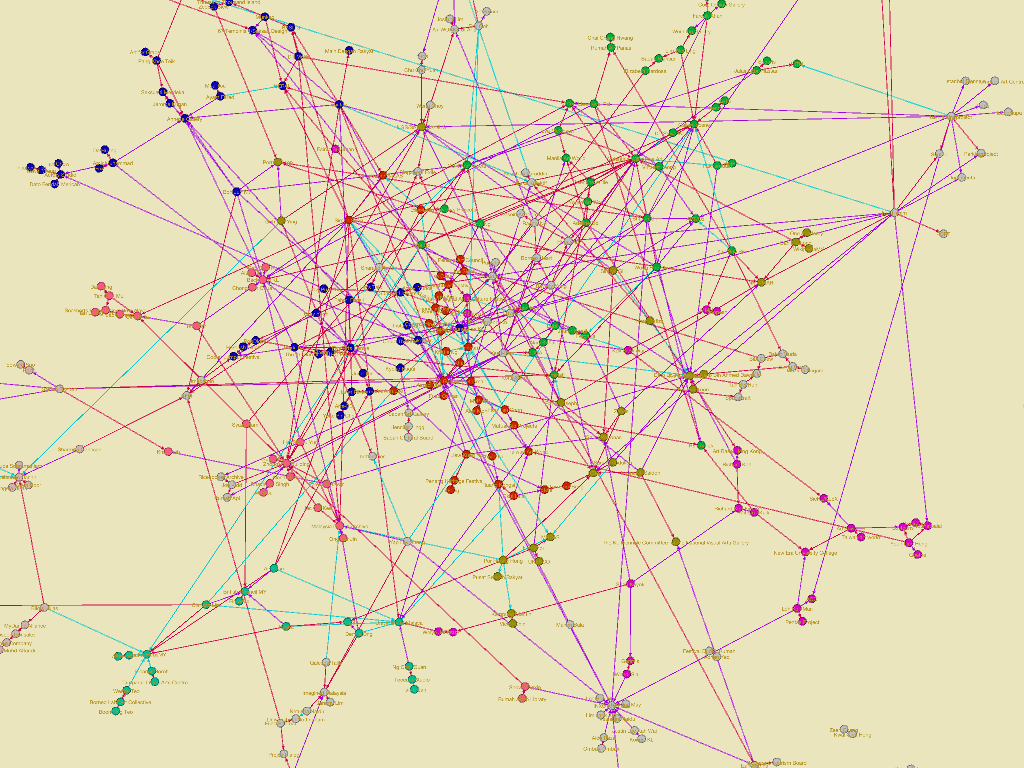
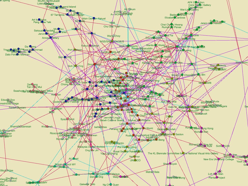
Network analysis' qualitative depth emerges when I start running the modularity test. I’ll explain the concept using the blue cluster, which has the highest modularity number. I call this the Five-Arts cluster. It's not that this is the largest community, rather modularity suggests that those in the community tend to form denser connections with one another. In short, this cluster is the most cliquish by far.

Trailing behind is the art gallery cluster. Of this, it is heartening to know that AFK collection is not only inconsequential and self-inflated (but this is not news), but that like it or not, its past will always haunt the collection for it is networked to the artworld by all the galleries that the egotistical collector profess to hate today.
There's also an interesting bit about the Valentine Willie Fine Art sub-cluster within the art gallery cluster (green). While the person is not particularly networked in the Malaysian art scene, the gallery as an institution is. or was.


However, unlike say the five arts cluster which is a lot more concentrated, this sub-cluster is much more dispersed. Also it occupies a less central position, a bit to the right side of the graph, suggesting that if it has influence - this is in the past tense. Those that the gallery influenced have gone on and undertake work elsewhere and have aligned themselves to different clusters.

A significant cluster that is related to the gallery cluster but gained enough weight to form its own is the Ilham Gallery (orange-red) cluster. lham's prominence unintentionally upstaged Balai's former preeminence. Compared to the Five Arts cluster, the Ilham cluster is a lot more diverse as a network. Given that Ilham is a private museum with regular public programmes, it wasn’t so selective in who it chooses to work and tend to build bridges across many different communities.

The takeaway for me this weekend is that when dealing with big data, sometimes it is difficult to know where to start, which makes it difficult to have something interesting to say. At the end of the day, what I learned as a n00b is that network analysis are kinda like visual prompts for a planar form of story telling.
It’s surprising what a plane of abstract lines can tell us about the distributed nature of power, which we often like to pretend is a nebulous thing. But Ben Anderson suggests that power (not just for the Javanese I venture) is concrete. A graph like this not only puts self-aggrandisement of some collectors in check, but also lay out many of the accumulated powerlines of artists or cultural worker who feign powerlessness.
In the end, I like to think of it as using computing tools to make ideas and stories appear in a Rorschach inkblot. Yet to be able to tell these stories coherently, one has to rely on one's god-given and humanities-honed interpretive faculties.

**
With the same set of data, I’ve also created an interactive version using Flourish.